

Wondering how to create a dashboard in Kibana to visualize and analyze your log data?
In this blog post, we’ll provide a step-by-step explanation of how to create a dashboard in Kibana. You’ll learn how to use Kibana to query indexed application and event log data, filter query results to highlight the most critical and actionable information, build Kibana visualizations using your log data, and incorporate those visualizations into a Kibana dashboard.

What is Kibana?
Kibana is an open-source data analytics and data visualization software used by data scientists, CloudOps and IT security teams to explore, monitor, and extract insights from structured log data. Once log data has been centralized (with a log aggregation tool, e.g. Fluentbit, Logstash or Amazon CloudWatch) and indexed (e.g., with Elasticsearch, Amazon OpenSearch Service, or ChaosSearch®), IT analysts can use Kibana to perform queries and filtering, construct data visualizations, and combine those visualizations into dashboards that reveal valuable insights into system security and application performance.
Some organizations use Kibana in combination with Logstash and Elasticsearch as part of the open-source ELK stack log analytics solution. Logstash is used to aggregate, parse, and transform log data before indexing the data in Elasticsearch. Once data is indexed, Elasticsearch allows users to query the data in different ways and produce tables that can be visualized using Kibana.
At ChaosSearch, we’ve integrated the OpenSearch version of Kibana (a.k.a OpenSearch Dashboards) directly into our comprehensive log analytics solution. ChaosSearch transforms Amazon S3 into a data lake repository for log and event data, allowing DevSecOps teams to aggregate, index, and analyze log data in real-time, with no data movement and no ETL process.
With ChaosSearch, log data is aggregated in Amazon S3 buckets whose full functionality is available from within the ChaosSearch console. Log data in S3 buckets can be indexed using our proprietary Chaos Index® format, and DevSecOps teams can enable Live Indexing to index newly-created objects in specific Object Groups, enabling near real-time querying for data as it becomes available.
Learn more about getting your data into S3:
CloudFront Logs in Amazon S3, Quicker than Ever
How to Move Kubernetes Logs to S3 with Logstash
CloudWatch Logs to S3: The Easy Way
How to Create an S3 Bucket with AWS CLI
Once log data has been indexed by ChaosSearch, users can leverage the ChaosSearch Refinery® to clean, prepare, and transform the data without writing or executing any code. This results in the creation of an Index View: a logical index, based on a physical index, ready for discovery, visualization, dashboarding, and analysis using Kibana.
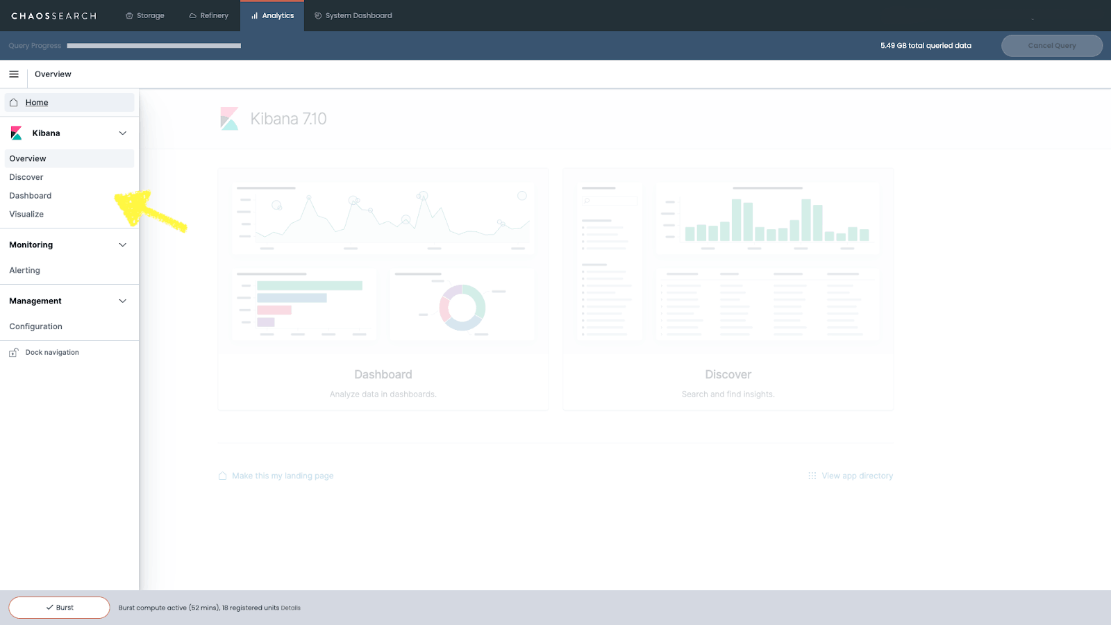
Before we dive into all of the details and the how-to portion of this guide, let’s start with a brief overview of the main Kibana functionalities. Opening the left sidebar of Kibana, you’ll notice five key capabilities that you can leverage to support your log analytics program.
These tools include:
How Kibana Can Support Your Log Analytics
Discover
Kibana’s Discover tool is usually the starting point to data exploration. It gives you the ability to interact quickly with your data through search and filters. After choosing which Index View you’d like to work with, Kibana will allow you to submit search queries, filter the results, and view document data from your log files. If the data is timestamped, a histogram representation of your data will be automatically generated at the top of the page.
Visualize
Kibana’s Visualize tool allows you to construct different kinds of visualizations using the ChaosSearch indices you have created.
Dashboard
Kibana’s Dashboard tool gives you the ability to combine log data visualizations built from your ChaosSearch indices into functional dashboards. Using dashboards with real-time indexing allows you to automatically update dashboards in near real-time as events are logged in your Amazon S3 buckets.
Alerting
With the ChaosSearch Kibana integration, you’ll notice an added feature called “Alerting.” This feature gives you the ability to monitor log and event data in real-time, create customized alert triggers, and set a destination (Slack channel, email, AWS chime, etc.) where notifications may be sent when an alert is triggered.
Management
Finally, Kibana’s management interface gives you the ability to adjust Kibana’s runtime configuration and tweak advanced settings to change how Kibana behaves as you Discover, Visualize, and Dashboard your log data.
Next, we’ll take you through the process of data discovery, visualization, and how to create a dashboard in Kibana.
Transeo Loves Building Dashboards in ChaosSearch - Read the Case Study!
How to Discover Your Data in Kibana
Kibana’s Discover screen is where you’ll be able to perform queries and create summary tables based on your indexed log data. As a prerequisite for using the Discover tool, you’ll need to have ingested some log data into your S3 buckets and have created ChaosSearch Index Views using the Refinery tool.
Having done so, you’ll be able to query those Index Views and apply filters on the Discover screen.
Searching in Kibana
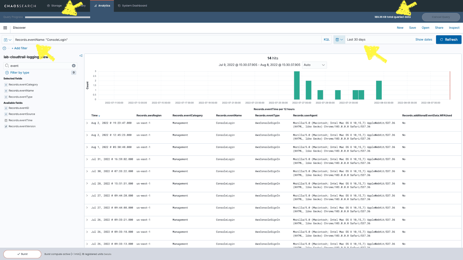
In this example, we’re using Kibana’s Discover screen to explore log data from AWS CloudTrail, which allows you to monitor and record all account activity across your AWS infrastructure.
1. Exploring AWS console login events in CloudTrail
Using the drop-down menu on Kibana’s left sidebar, we could select the Chaos View we created previously using the ChaosSearch Refinery® tool. Beneath our selection, Kibana shows us all the fields present in the View that we might choose to query from. For this analysis, we’re interested in exploring AWS console login events present in the CloudTrail.
Looking under the heading “Available Fields,” we can search for a field called “Records.eventName,” which contains the name of the logged event. To set up our query, we’ll need to use the Query/Search Bar at the top of the Kibana Discover page to express our query using the Kibana Query Language (KQL). In this case, we’re looking for ConsoleLogin events, so our query in KQL reads Records.eventName: "ConsoleLogin."
2. Isolating AWS console logins from CloudTrail logs
With this query, we can isolate all of the ConsoleLogin events from our CloudTrail logs. We can also specify an absolute or relative data range for our query - here, we’ve chosen to exclusively analyze data from the last 90 days. Finally, we hit the Refresh button to see the results from our query.
Once you’ve entered your query, Kibana will return a list of results that match your query parameters. You can click on each result to expand it and view all data from that log file in table or JSON format.
Watch this quick demo to learn more about how to analyze CloudTrail logs with ChaosSearch:
3. Exploring large datasets in Kibana
ChaosSearch is built from the ground up for analyzing vast amounts of data, usually on the Terabyte and Petabyte scales. For this reason, our version of Kibana includes some additional features required when exploring these large datasets. The first one is a Query Progress Bar which monitors the status of your query. There is also a Cancel Query button used to abort queries when for example, you detect an error on your search syntax or search terms. Finally, there is a counter that indicates the Total Queried Data, which gives users instant feedback on how much data the query is running against.
Another useful feature of Discover is the ability to select specific fields to be listed on the event details table, giving you a clear view of the fields you're interested in for your query. All other fields for the event are now hidden but can still be accessed by expanding any particular event.
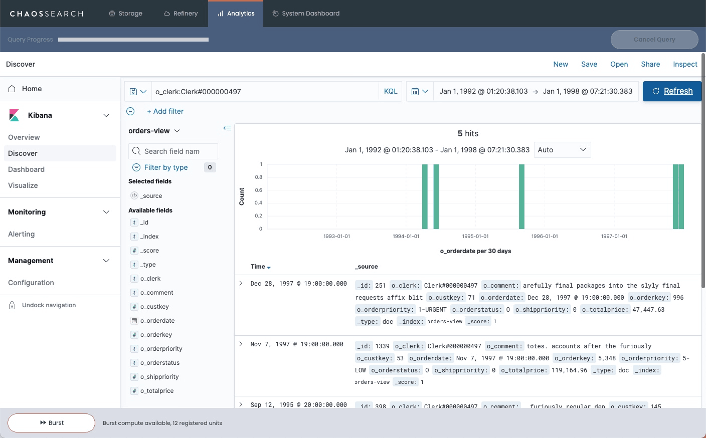
When you’re happy with your query, you’ll need to click the Save button and enter a name for your query before you can turn your query results into a Visualization.
How to Build Visualizations in Kibana
Once you’ve queried your data, it’s time to transform your results into a visualization with Kibana's data visualization tools. Clicking the Visualize button on the left sidebar will bring you to the Visualizations screen, where you can create a new visualization or access visualizations you have previously created. To build a new data visualization, click on the Create Visualization button.
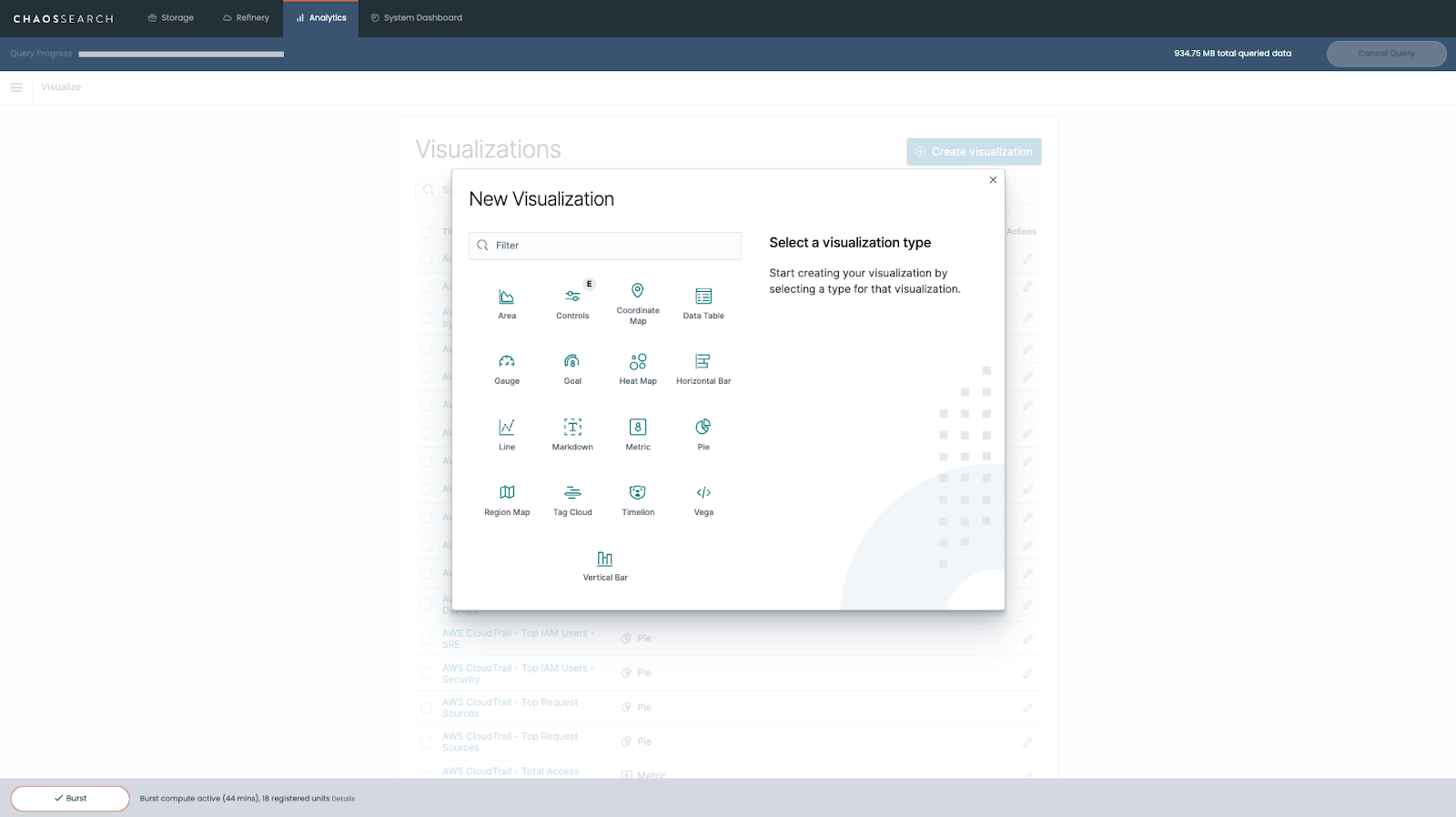
Kibana allows you to create many different types of charts, including area plots, data tables, gauges, goal trackers, heat maps, bar charts, line graphs, and more. The right option for you will depend on the specific goals of your analysis. You can read a short description of each visualization format to help determine the best choice for your intended use case.
1. Identifying a data source for your Kibana visualization
After choosing a format for your visualization, you’ll need to identify a data source. You can choose either a saved search (like the one we created above) or perform a new search by selecting the Chaos View with the data you want to visualize.
In this example, we’re using our indexed CloudTrail log data to create a visualization of event names generated over the past 30 days.
In our previous example, we focused specifically on Console Login events, but now we’re interested in all types of events and how frequently they appear in our log data. To shed light on that, we chose to organize our events data into a Pie Chart.
2. Configuring the Kibana visualization builder
After selecting a visualization format and data source, it’s time to configure the visualization builder to display your data in a useful way.
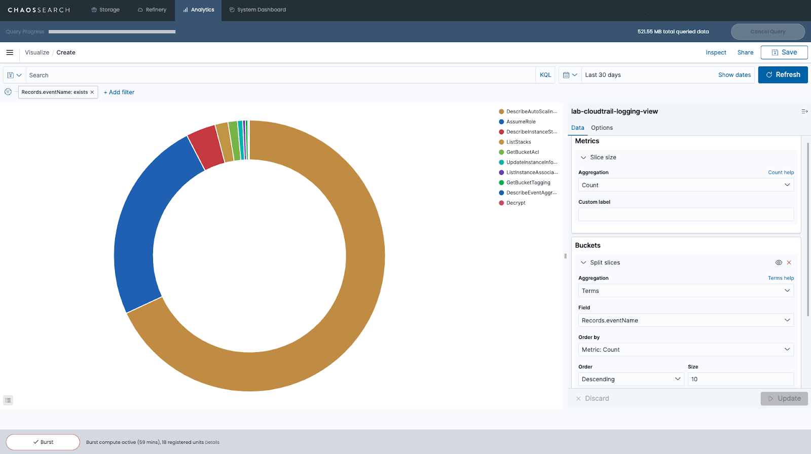
Configuration options in the visualization builder will vary depending on the visualization format you choose for your data. For a pie chart, you’ll need to use two aggregations: the Metrics aggregation and the Buckets aggregation.
The Metrics aggregation establishes how the size of each slice in your pie chart will be determined. In this example, we’re using the Count aggregation, so the size of each slice will reflect the total number of events for a particular event name within our source data (relative to the whole, since it’s a pie chart).
The Buckets aggregation determines what information is being retrieved from your data set to create the graph. In this example, we use the Terms aggregation, which allows us to display the top 10 most frequently occurring Event Names in our data.
3. Modifying visualizations by adding filters
Finally, we created a filter to remove events without information on the EventName field from our pie chart related to CloudTrail log file integrity events.
You can modify visualizations by adding more filters, changing the date range, or even changing the colors. If you hover your mouse over a slice of the pie chart, you’ll see a small pop-up window with details about the data for that specific slice. When you’re done creating your visualization, you’ll need to click Save and give it a name before using it to create a dashboard in Kibana.
How to Create a Dashboard in Kibana
Creating functional and informative Kibana dashboards is a great way to start monitoring applications and AWS services in real-time. To get started, you’ll need to click “Dashboard” on the left sidebar, then click “Create new dashboard.” Next, you’ll be asked to Add Panels to your Kibana dashboard.
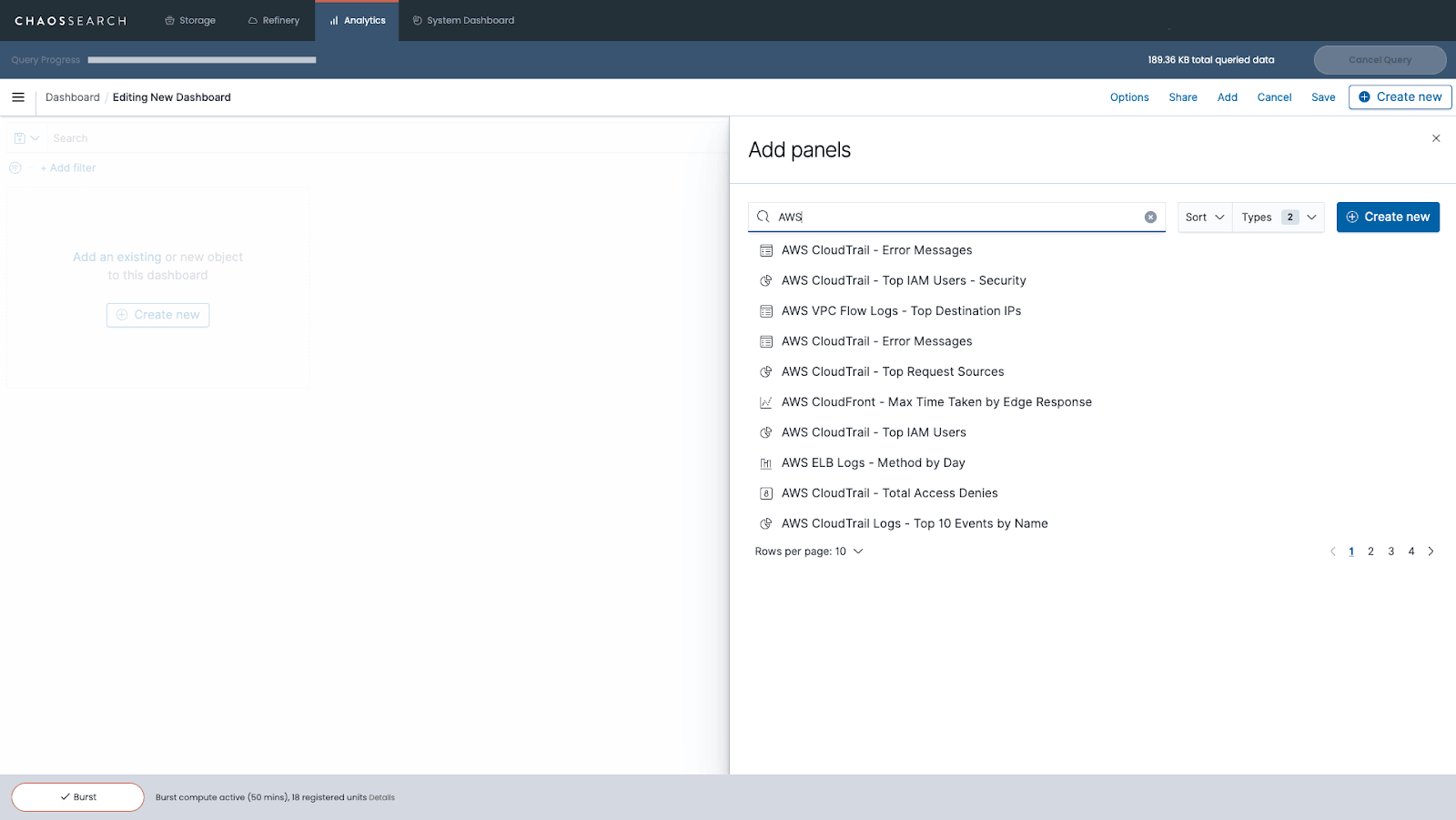
Panels are the building blocks of dashboards in Kibana. Any visualization you have previously created and saved in Kibana can be added as a Panel in your dashboard. You can also add a Text panel with static information about your dashboard or a Controls panel that allows you to filter your data in real-time. Panels can also be used to display a saved search table from the Kibana Discover tool, a table of live-streaming logs, or the results of machine-learning anomaly detection jobs.
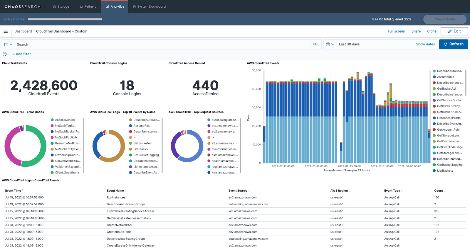
You can also clone panels within a dashboard, copy panels to a separate dashboard, and even apply filters until every panel in your dashboard shows the data and information you want to see.
4. Arranging panels and Kibana dashboard elements
Once you’ve specified what data should be included in each panel on your dashboard, you’ll be able to arrange and reorganize panels and other dashboard elements and apply design options to make your dashboard more visually appealing and functional for users.
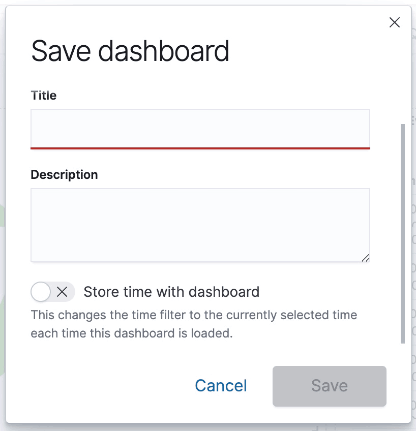
Once you have finished, you can click the Save as button to add a title to your completed dashboard and save it for future reference.
You can share your newly created Kibana dashboard in several ways: by embedding it as an iframe on a webpage, sharing a direct link, or generating a PDF or PNG report of your dashboard.
As you get more familiar with how to create dashboards in Kibana, you’ll be able to build more visually appealing and informative dashboards to support your application monitoring and security log analytics initiatives.
Use Kibana for Real-Time Insights into Your Log Data
Now that you’ve learned how to create a dashboard in Kibana, what’s next?
If you haven’t yet, now would be a great time to configure real-time indexing for the log data included in your dashboard. With real-time indexing, the log data you generate is used to automatically update your indices, visualizations, and dashboards in Kibana.
As a result, you’ll be able to gather real-time insights into network security and application performance, and you can even configure customized Alerts to notify you when anomalies are detected in your newly ingested log data.

Additional Resources
Read the Blog: How to Integrate BI and Data Visualization Tools with a Data Lake
Watch the Webinar: DATAVERSITY Demo Day
Check out the Whitepaper: Digital Business Observability: Analyzing IT and Business Data Together

